

Analysis about American births from 2000 to 2014
PowerNAP By: Victor He
Introduction:
the target data set I work on is the American births from 2000 to 2014. The data set is available on US births 2000 to 2014 | Kaggle. In this document, there are five columns, including the year (from 2000 to 2014), the month (from 1 to 12), the month date (from 1 to 31), the weekday (from 1 to 7), and the number of births. In the following article, I will comprehensively demonstrate their basic information, their changing patterns, and their internal relationship by using the statistical tools in EXCEL.
Basic Information
In this part, I will brief demonstrate the data to audience with charts from overall situation, birth for year, birth for month, birth for month date, and birth for day of weeks.
Birth frequency
Table 1
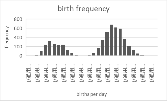
From table one, it is clear that the birth frequency is two clusters centered around 7828 and 12728 with a gap at 9928. After closer analysis, the huge gap between the two clusters is caused by Americans’ different birth behavior differences between weekends and weekdays. To be specific, the birth number in the cluster around 7828 is mainly happening on weekends and the birth number in the cluster around 12728 is mainly happening on weekdays. This discovery will be fully explained in the following section (Birth- weekday).
Birth – year
Table 2
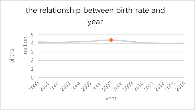
From table 2, the American birth number from 2000 to 2014 is mostly stable with a peak in 2007. The peak in 2007 has a lot of potential reasons. First, this phenomenon attribute to the low unemployment rate of 4.4% in 2007. Second, this phenomenon may connect with the Subprime mortgage crisis. Before the crisis happens, the accessibility of loaning stimulates the economy, making more people have the financial ability to raise a child. Both factors may contribute to the baby boom in 2007.
Birth-month
Table 3
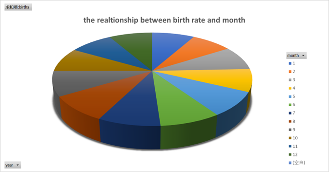
From table 3, the even divided chart tells the audience that the birth number in 12 months is mostly equal. This pattern is consistent with the flat line in table 2, showing that the people’s behavior at birth does not change too much on a long-time scale in “month perspective.”
Birth-month date
Table 4
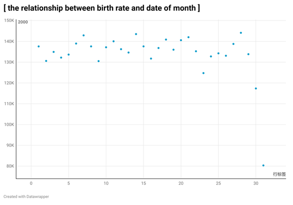
In the previous section, the data shows people’s behavior consistency. However, in this section, the data will show the audience that people’s behavior is inconsistency. In this table 4, the obvious outlier at 31st shows that only a few children are born on the last day of the month. This strange phenomenon has a simple answer that only half of the months in one year have 31st. After excluding the outlier, the data still shows the sign of inconsistency. From 1st to 30th, the data shows a trend of divergence. The points become more scattered and varied at the end of the month. This conclusion is supported by the truth that the minimum and maximum all happens at the end of the month and the discrepancy between data is more visible here.
Birth – day of week
Table 5
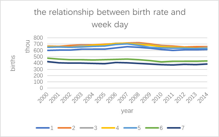
This table also partially is a more powerful proof of people’s behavior inconsistency. The birth number on Saturday and Sunday is largely less than it is on weekdays. The huge gap between weekends and weekdays is an important sign of inconsistency. Also, the huge discrepancy is responsible for the huge gap in table 1. However, this table is also proof of the behavior consistency aspect. The high overlap in weekdays illustrates that the birth number in normal time is almost the same in 14 years. Until now, the reason for the discrepancy is still unclear. One hypothesis is because of hospitals’ low capacity on the weekend.
Changing pattern
In this part, I will show audience the changing pattern from 2000 to 2014 in overall situation, birth for year, birth for month, birth for month date, and birth for day of weeks.
Table 6
| Coefficients | standard error | t Stat | P-value | Lower 95% | Upper 95% | |
| Intercept | 28337549 | 14338700 | 1.976298 | 0.069733 | -2639330 | 59314427 |
| X Variable 1 | -12053.7 | 7144.328 | -1.68717 | 0.115403 | -27488.1 | 3380.697 |
Overall Trend (Correlation)
Table 7
| month | correlation |
| 1 | -0.37994 |
| 2 | -0.3965 |
| 3 | -0.49204 |
| 4 | -0.38594 |
| 5 | -0.51167 |
| 6 | -0.38703 |
| 7 | -0.26671 |
| 8 | -0.2961 |
| 9 | -0.32927 |
| 10 | -0.38418 |
| 11 | -0.38801 |
| 12 | -0.30636 |
Month trend (Correlation)
Table 8
| month date | |
| 1 | -0.26855 |
| 2 | -0.21778 |
| 3 | -0.14089 |
| 4 | -0.10307 |
| 5 | -0.35685 |
| 6 | -0.409 |
| 7 | -0.35704 |
| 8 | -0.33028 |
| 9 | -0.23258 |
| 10 | -0.27497 |
| 11 | -0.27718 |
| 12 | -0.3989 |
| 13 | -0.37274 |
| 14 | -0.38971 |
| 15 | -0.31886 |
| 16 | -0.25866 |
| 17 | -0.23192 |
| 18 | -0.26721 |
| 19 | -0.41448 |
| 20 | -0.39931 |
| 21 | -0.35425 |
| 22 | -0.21452 |
| 23 | -0.0692 |
| 24 | -0.22262 |
| 25 | -0.27229 |
| 26 | -0.40555 |
| 27 | -0.3397 |
| 28 | -0.35405 |
| 29 | -0.24682 |
| 30 | -0.16964 |
| 31 | -0.26125 |
Month Date Trend (Correlation)
Table 9
| day of week | |
| 1 | 0.122073 |
| 2 | -0.23053 |
| 3 | -0.27647 |
| 4 | -0.34474 |
| 5 | -0.4002 |
| 6 | -0.83093 |
| 7 | -0.79835 |
| 8 | -0.42383 |
Week Trend (Correlation)
From table 6, 7, 8, 9, It is easy to show an overall decreasing trend for birth numbers. This decrease is not an occasional situation since it simultaneously happens in 5 different aspects. This comprehensive comparison is good proof of the Reducing fertility rate in America. The correlation in table 6 successfully predicts the decreasing birth in 2015 to 2019.
Relationship (The most surprising discovery)
The birth number change patterns all have relatively high correlation, partially because of the people behavior consistency. However, after digging in the number deeper, I found a very important pattern underlying the data.
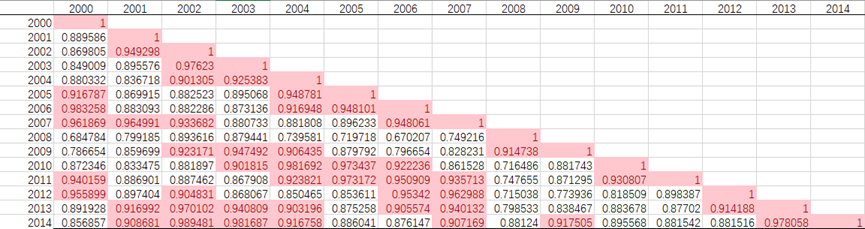
Table 10
In this table 10, the correlation coefficient among different month dates, I highlight the coefficient larger than 0.75, finding that the large coefficient always appears with a seven-day periodic pattern. This finding shows the high correlation coefficient among a certain day of the week. However, the reason why people’s behavior pattern is highly similar in one day of the week is still unclear.
After finding this one, I have a question: whether this pattern appears in other tables? After working on this for a long time, the answer was dug out: yes.
Table 11
From table 10, I find that such a periodic pattern also appears on the year scale. The birth pattern in one year is much more like the birth pattern after 5 years and 10 years. This discovery surprised me and I cannot find any reason why such a thing will happen on the national birth pattern. Why will people’s behavior patterns appear again after 5 years even with different policies, different economic situations, and different presidents? There seems no explanation could tell me that why a similar scenario happens in two different situations after five years.
However, the meaning of this discovery is significant. This partly proves that “History always spirals upward.”
Conclusion
From this analysis, there are three very important conclusions I get.
First, people’s birth pattern is consistent on a long-time scale, including months and years. However, the patterns will become inconsistent on a short-time scale, including a day in week and month.
Second, the decreasing trend in birth numbers happens in every factor except the unusual baby boom in 2007 brought by the subprime crisis and the low unemployment rate.
Third, the birth patterns have a very strange periodic pattern in month scale and year scale. After a while, a similar birth pattern will appear again in a different environment. This is the most surprising finding I discover from this data set.