

Personal Project Proposal: US Statistics of Birth from 2000 to 2014
PowerNAP by: Jinwoo Ahn
Analyzing Daily Report of the Birth
1. Introduction
Daily record of the United States of Birth from 2000 to 2014 is provided. Given data set is accurate. However, it is difficult to apply into the other area only with the given set. In other words, analysis and explanation are required. In this project, all of the analysis was conducted through R, especially using ggplot2 package in the visualization process. Also, mutation and comparison were made during the analyzation process.
1.1 Visualize everyday recorded birth in US from 2000 to 2014
Observed:
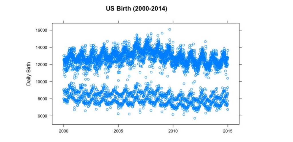
1. There are two layers shown, top and bottom.
2. Constant showing of fluctuation.
3. The general trend can be predicted by the trend of the gap between two layers. Here, it is hard to achieve the meaningful result with the given data.
1.2 Visualize everyday recorded birth in US from 2000 to 2014 in logarithmic scale
Observed:
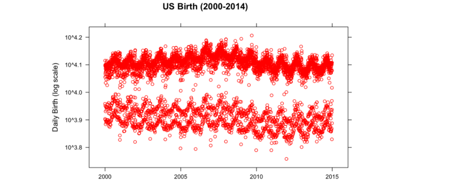
1. Even though logarithmic scale was applied to check the scale, similar trend is shown.
1.3 Summary
After reviewing the plot, three questions will be taken into account
1. What causes the layers to happen?
2. What causes the cyclical fluctuation?
3. How to define a general trend?
2. Finding the Reason of the Layers
2.1 Concept
• Just by looking at the plot, it is difficult to visually notice the difference between the top and the bottom layer.
• To cluster two layers into each group
2.2 Set and Check the standard
To compare the top and bottom of the layer, have to set the standard. When average birth rate of the entire population is calculated, value is 11350 (births). Also, to make sure the distribution of the data, it can be checked by comparing median and mean The median value is 12343 (births).
Here, one can conclude there is no significant skewness, since there is the difference between mean and median is small.
2.3 Find the statistic of each layer
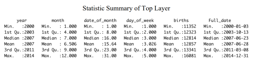
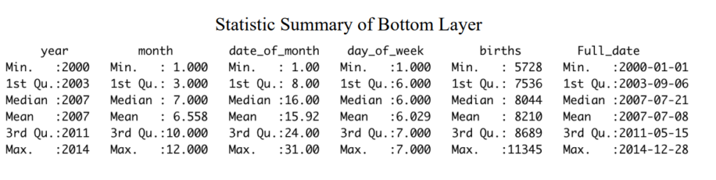
Numerical values are accurate, but it is difficult spotting the difference at a glance.
2.4 Visualization
Box plots are made to compare two layers, by year, month, date, and day of month.
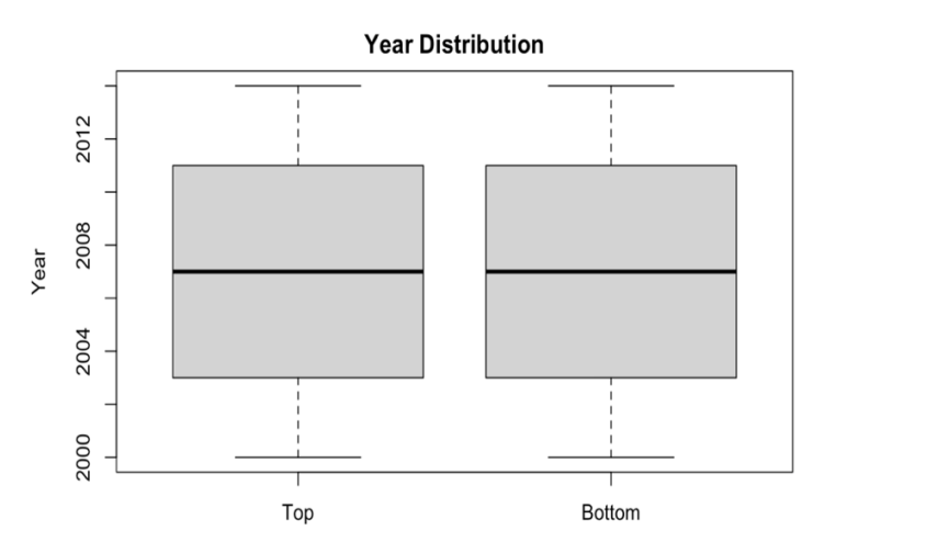
I. Box plot by Year
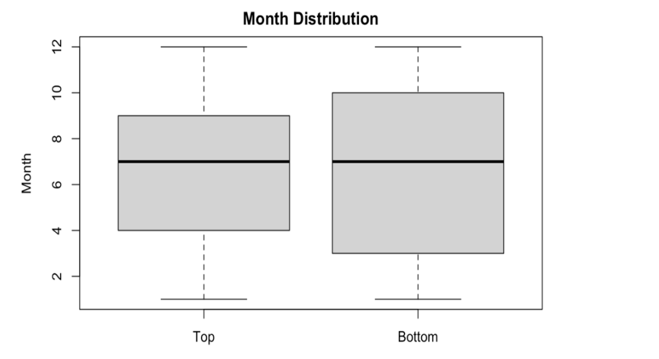
II. Box plot by Month
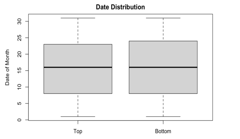
III. Box plot by Date
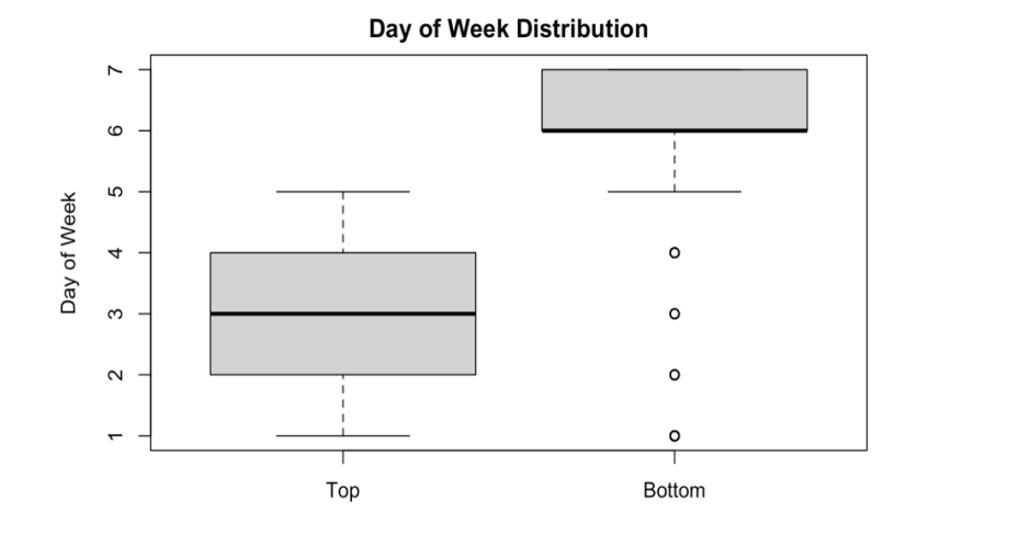
IV. Box plot by Day of Week
Observations:
1. The given data suggests that the day of week giving birth matters. When top and bottom layers are compared by Date of Week, lower layer shows concentration in 6 and 7. The top layers, however, has mean of 3. Since each number from 1 to 7 represents the day of the week from Monday to Sunday, it can be found that the people give less birth during the weekends.
2. Except from the day of week box plots, other box plots show similarity in distribution. There are slight difference in some of the box range, but the general mean and the range are similar. In other words, it can be assumed that they are moving in very similar trend.
2.5 Conclusion
The difference shown in the box plot of the Date of Week between two layers, suggests that the gap is caused by people giving less birth during the weekends. There can be multiple reasons, and can be further examined. Also, it is found that the two layers move in similar pattern provem by the box plots of the year, the month, and the date.
3. Finding the Reason of the Cyclical Fluctuation
Another recognizable trait was the cyclical fluctuation both shown from top and bottom layers. Since the statistical similarity of both layers have been checked, it is okay to combine both layers when analyzing the reason of the cyclical fluctuation. Three groups will be made, each by year, month, and week. If cyclical fluctuation show in the plot, it will be further analyzed.
3.1 Plot After Combining Two Layers
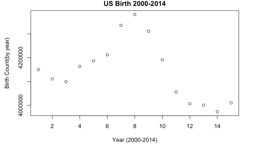
I. US Birth from 2000 to 2014 by year
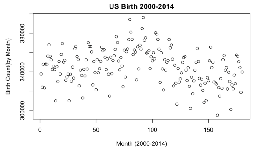
II. US Birth from 2000 to 2014 by Month
III. US Birth from 2000 to 2014 by Week
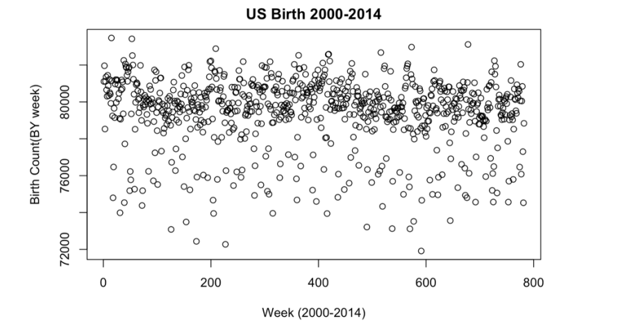
Note: To fit the data by week, 5 days had to be trimmed from the original data
Observation:
1. The clear general trend is only shown in plot by year.
2. It gets harder to find the general trend as the measure shortens. The observations are dispersed. There may be a fluctuation, but further analysis is required for clear explanation on the cyclical fluctuation shown earlier.
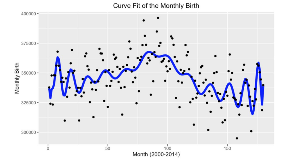
3.2 Polynomial Curve Fitting and Interpolation for Fluctuation Prediction Since the project was conducted through R, polyfit() and polyval() from parcma package were used to calculate polynomial curve fit on US Birth from 2000 to 2014 by Month and by week. Fluctuation will be checked.
I. Curve Fit Line on the Monthly Birth
II. Curve Fit Line on the Weekly Birth
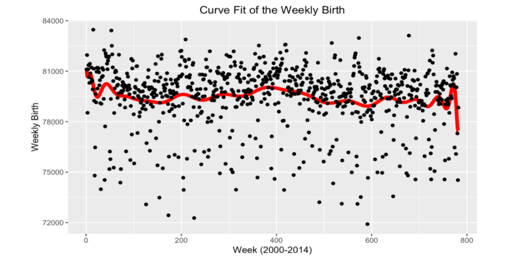
Observation:
The polynomial curve fit is more applicable for the Monthly Birth. In Weekly Birth, the curve lacks in representing values in the outer range. Now to find the suitable explanation of the fluctuation, further analysis will be done on birth-month relationship.
3.3 Grouping by Month
Before expanding to whole data, take first three years to check the tendency.
Month that recorded more birth than average of each year
| 2000 | 2001 | 2002 |
| March | March | March |
| May | May | July |
| June | July | August |
| July | August | September |
| August | September | October |
| September | October | December |
| October | – | – |
| December | – | – |
Note: Just by looking, some months tend to appear more often
3.4 Formulate Frequency Table
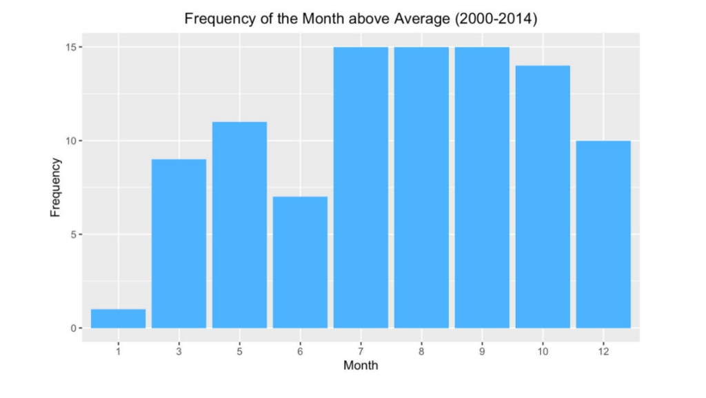
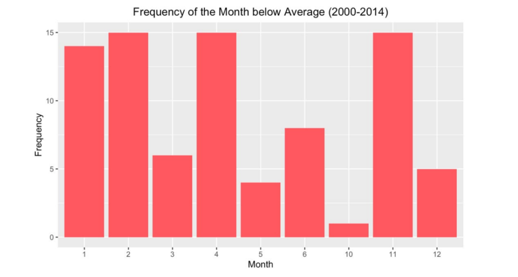
Table that counts the frequency of the month from 2000 to 2014 is calculated and visualized in bar plot.
I. Months that are above Average
II. Months that are below Average
Observation:
When frequency of the months is counted that are below and above the average, there was a difference in distribution between two groups. Months with more days reported higher. However, September was an exception. It can may be reasoned due to start of the school season, yet to fully explain the high birth rate in September, more external sources are need. Also, seasonal trend was spotted. November to February recorded low while from May to September the number increased. This also cannot be directly explained, only the tendency is shown.
3. 5 Conclusion
By curve fitting the US Birth by month and by week, the fluctuation was clearly shown from the month distribution. Then two frequency tables were made to record the counts of the months that are each above and below monthly average. Then it became evident that the different number of working days causes the fluctuating pattern from the overall data set. Yet, there was one exception, September. Even September has 30 days, it consistently recorded above average.
4. Finding the General Trend & Final Conclusion
4.1 Finding the General Trend
When it comes to finding the general trend of the US Birth, yearly birth counted is suitable. Monthly birth count can be difficulty due to seasonal fluctuation, and weekly birth count is also difficult due to its spread. If one desires to use the monthly birth count, one can make an
extrapolation by extracting the points of each fluctuating peaks. It can function as one way of prediction. However, yearly birth count suggests better understanding of a general US birth rate since it is easier to be manipulated.
4.2 Final Conclusion
Starting from the United States daily birth record which ranges from 2000 to 2014, it was difficult to understand without mutation and explanation. Two problems were showing of two divided top and bottom layers, and the other was the cyclical fluctuation. To discover the reason behind to layers, each layers was clustered, and statistical break down was conducted. There was difference only shown in the distribution of the day of week; bottom layer’s mean was 6 and the top layer’s was 3. The concentration of having birth during the weekdays was the cause of creating the gap. After combining the two layers, the cause of cyclical fluctuation was taken into account. To check when the pattern first appear, the graph was plotted by each time span, year, month and week. Yearly birth did not showed, and it was hard to decide other two showed the pattern. Polynomial curve fitting was used, and monthly birth showed in fluctuating pattern. When the frequency table was made to record the count of the months that are above and below the monthly average of the year, months during the winter season tend to record more in below, and moths during summer to early autumn recorded more in above. This explains the fluctuation.
This breakdown analysis of the United States daily birth record from 2000 to 2014, suggests how to the better understand. To explain the reason of having more birth during the weekdays and during certain season, will require external explanation.